Learning, Teaching, and Technology
A blog created for Webpage 2.0
Search This Blog
Bach Partita
Subscribe To
Posts
Atom
Posts
Comments
Atom
Comments
Followers
Blog Archive
▼
2012
(2)
▼
August
(2)
I have very mixed feelings about infographics. Too...
Embed a YouTube Video
►
2010
(18)
►
October
(2)
►
April
(1)
►
March
(3)
►
February
(12)
About Me
Theo
I teach Instructional Technology at a special education non-public school in Maryland.
View my complete profile
Monday, August 13, 2012
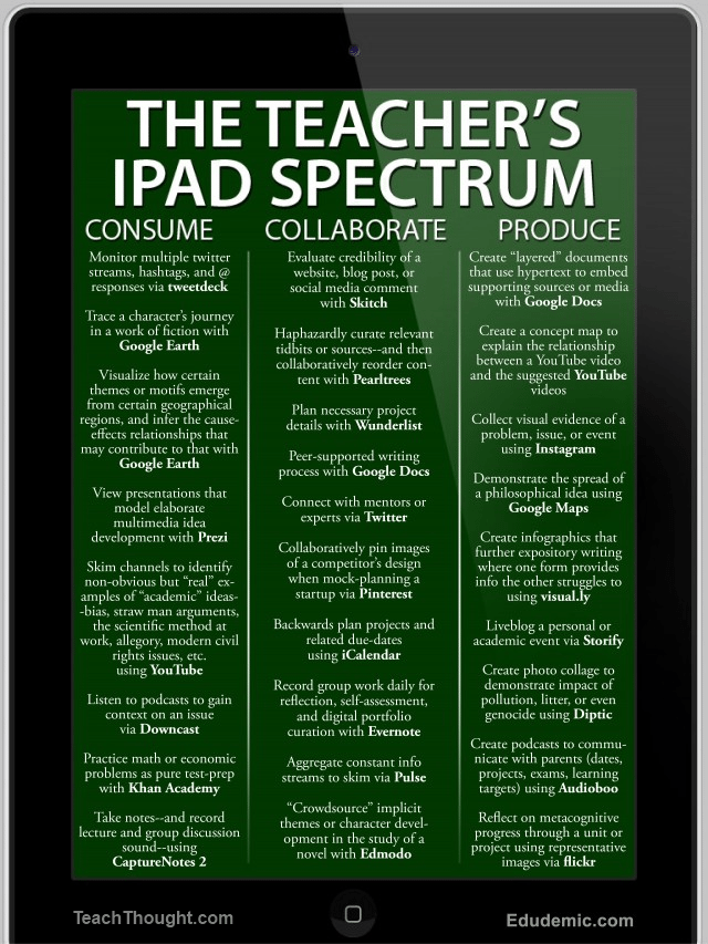
I have very mixed feelings about infographics. Too many of them lack focus contain too much content, and have no logical or design flow. However, I'm including this one because it's a useful chart -
[Source:
Teach Tought
] and
Edudemic
No comments:
Post a Comment
Older Post
Home
Subscribe to:
Post Comments (Atom)


 [Source: Teach Tought ] and Edudemic

No comments:
Post a Comment